If you’re not familiar with the term “Responsive Web Design” (RWD), you’re not alone. Although it is the singular topic of discussion among professionals in the web industry, it has only recently come to the attention of business owners. For companies of all kinds, it has quickly risen to become a top priority for 2014 — the sooner a business can build a responsive site the better.
What is Responsive Web Design?
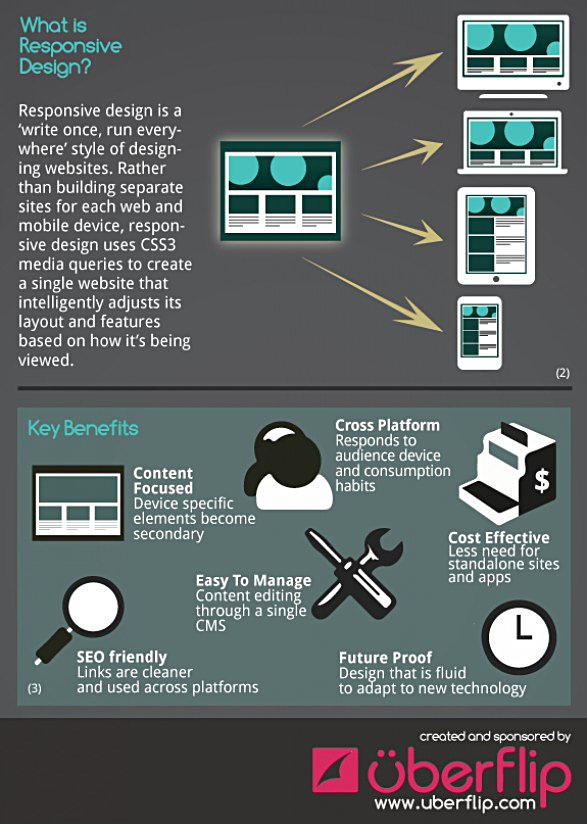
Simply put: a website that adjusts automatically to fit and function on various screen sizes and computing devices — desktops, laptops, tablets, and smartphones — providing for both click and touch navigation.
How can you tell if a site is responsive?
The fastest method is to pull up a website on a desktop or laptop, go to the lower right corner of your browser window and drag the corner to resize the screen. As you drag the window smaller, if the website “adapts” to the various screen sizes, it is responsive. If the content does not reflow and resize to fit the narrower width of the window, it is not responsive.
Why is this important?
Five years ago, it wasn’t an issue. But now, with the increasing use of mobile devices, especially tablets and smartphones, fewer people are accessing web content using a desktop or laptop computer. In some cases, the ONLY device used by consumers is a mobile unit. Some experts predict that by the year 2017, 5 billion people will own smartphones; 45% of them will use their phones exclusively for all internet searches and transactions.
Regardless of the business you’re in, the implications are staggering. Joshua Steimie, writing for Forbes.com, says “without a mobile-friendly website your future online is bleak. If you’re not providing a mobile-friendly experience for your customers, they’ll bounce off your website and go to your competitor whose website is easier to use. The future is mobile, as we see people increasingly favoring their mobile devices over desktop computers.”
One might say that if you do not embrace the necessity of making your website mobile friendly, your business will go the way of the dinosaurs. Extinction.
Calculating the Cost.
Designing and programming a responsive website can be as much as 50% more than a standard “fixed width” conventional site. Do you have an existing website that needs to be made responsive? Or are you starting from scratch? In either case, the real cost is the amount of business you will lose if your current and potential customers shop elsewhere because they are unable to access your site using a mobile device. How much will it cost you to lose customers? Now compare that with the cost of a responsive design.
Interested?
Call us for a responsive web design quote at 253-951-3052, or click here to fill out our online Quote Request Form.
Examples of Responsive Websites
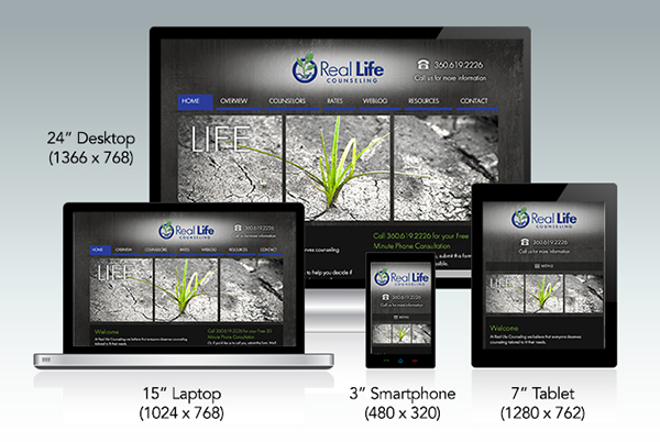
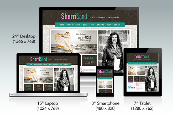
The images below are linked to websites designed and programmed by our creative team. Click on each picture to launch the site. If you are on a desktop or laptop computer, grab the lower right corner of the display window and by dragging, watch as each site responds to narrower screen sizes.


For more examples, visit our Scuttlebird web design portfolio.
Why You Need a Responsive Website
If you’re not familiar with the term “Responsive Web Design” (RWD), you’re not alone. Although it is the singular topic of discussion among professionals in the web industry, it has only recently come to the attention of business owners. For companies of all kinds, it has quickly risen to become a top priority for 2014 — the sooner a business can build a responsive site the better.
What is Responsive Web Design?
Simply put: a website that adjusts automatically to fit and function on various screen sizes and computing devices — desktops, laptops, tablets, and smartphones — providing for both click and touch navigation.
How can you tell if a site is responsive?
The fastest method is to pull up a website on a desktop or laptop, go to the lower right corner of your browser window and drag the corner to resize the screen. As you drag the window smaller, if the website “adapts” to the various screen sizes, it is responsive. If the content does not reflow and resize to fit the narrower width of the window, it is not responsive.
Why is this important?
Five years ago, it wasn’t an issue. But now, with the increasing use of mobile devices, especially tablets and smartphones, fewer people are accessing web content using a desktop or laptop computer. In some cases, the ONLY device used by consumers is a mobile unit. Some experts predict that by the year 2017, 5 billion people will own smartphones; 45% of them will use their phones exclusively for all internet searches and transactions.
Regardless of the business you’re in, the implications are staggering. Joshua Steimie, writing for Forbes.com, says “without a mobile-friendly website your future online is bleak. If you’re not providing a mobile-friendly experience for your customers, they’ll bounce off your website and go to your competitor whose website is easier to use. The future is mobile, as we see people increasingly favoring their mobile devices over desktop computers.”
One might say that if you do not embrace the necessity of making your website mobile friendly, your business will go the way of the dinosaurs. Extinction.
Calculating the Cost.
Designing and programming a responsive website can be as much as 50% more than a standard “fixed width” conventional site. Do you have an existing website that needs to be made responsive? Or are you starting from scratch? In either case, the real cost is the amount of business you will lose if your current and potential customers shop elsewhere because they are unable to access your site using a mobile device. How much will it cost you to lose customers? Now compare that with the cost of a responsive design.
Interested?
Call us for a responsive web design quote at 253-951-3052, or click here to fill out our online Quote Request Form.
Examples of Responsive Websites
The images below are linked to websites designed and programmed by our creative team. Click on each picture to launch the site. If you are on a desktop or laptop computer, grab the lower right corner of the display window and by dragging, watch as each site responds to narrower screen sizes.
For more examples, visit our Scuttlebird web design portfolio.